Planning Blog: Title design
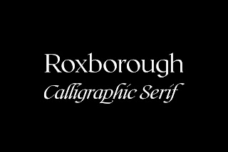
For the fonts we decided that we would use Roxborough Calligraphic Serif with a vibrant red color. The background would be black to show the contrast between the bright red and it attracts attention. Red is demanding and eye-catching. When it is displayed against a black screen attention will be called to the title, which will also bring up questions about the sequence. We decided that our title will be “The shifter” to represent the shift in behavior that will be displayed in our opening sequence.
The title will be displayed in big font and the rest of the title including the directors' names, the actors' names, the editors' names, and the names of the music artists will be displayed in smaller font. The people's name will be displayed in plain white in the Times New Roman font. The titles will be displayed on the screens by fading in and fading out. Each title will be on the screen for 3-6 seconds and then it will fade to the next title. It is most important that the audience reads the title of the film, the editor's name, the actors, and the director's name because of all the work put into the opening sequence. It is important to give credit to the people that helped with this production.
The photo above is the font that will be used for the title. Instead of a plain white it will be red, and the background color will remain white. The second photo will be the font used for names. It is plain and simple and it won't bring away too much attention from what is occurring in the back.


Comments
Post a Comment